Quick Status View
See the general status of your operations at a glance with clear, easy-to-understand visual charts.
Esta página aún no está disponible en tu idioma.
The Dashboard is your visual control center for monitoring warehouse operations. It shows charts of orders, inventory, and revenues or expenses from the last 14 days, letting you quickly see the status of your operations and make informed decisions.
See the general status of your operations at a glance with clear, easy-to-understand visual charts.
Monitor shipped, in-process, and backorder orders during the last 14 days to identify patterns and problems.
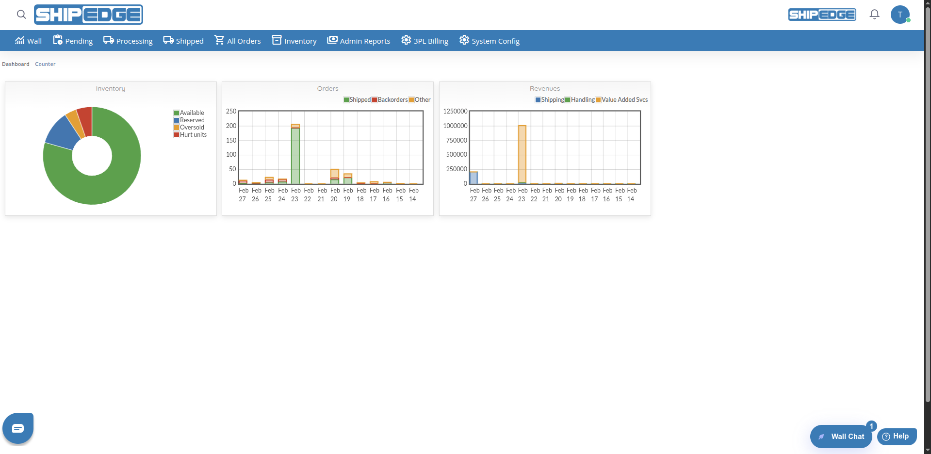
Quickly visualize available, reserved, damaged, and oversold inventory to make stock management decisions.
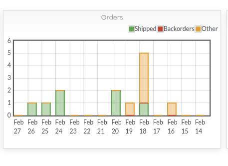
Review handling, shipping, and storage data (revenues or expenses by account) to understand warehouse operating costs.
Data updates automatically when you access the Dashboard, showing real-time information.
Data can be filtered by specific account (requires technical configuration) to see individual client metrics.
You can access Dashboard from:
The Dashboard shows three main charts: Inventory, Orders, and Revenues.
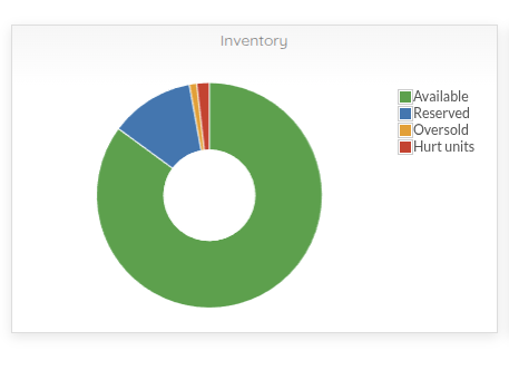
The Orders chart shows orders from the last 14 days in a stacked bar chart (bottom to top):
The chart shows daily trends for each order type, letting you identify days with high shipping volume, days with many backorders, or days with pending orders.
The Inventory chart shows current inventory status in a pie chart:
This chart helps you quickly understand your inventory distribution and identify problems like oversold or damaged units.
The third chart shows financial data from the last 14 days in a stacked bar chart. The title changes based on the view:
The stacked bars show (bottom to top):
The chart shows daily trends, helping you identify days with high costs and understand operating expense patterns.
Review daily bars
Each bar represents a day from the last 14 days. Total height shows total orders for that day.
Identify colors
Analyze trends
Look for patterns like:
Use the legend
The legend at the top right shows what each color represents. Click legend elements to show or hide specific series.
Review pie chart
Each segment size represents the proportion of that inventory type relative to the total.
Identify colors
Look for problems
Pay attention to:
Interact with the chart
Hover over a segment to see the percentage. Click a segment to see a summary with the exact percentage.
Review values
The chart shows approximate values for visualization. For exact values, consult detailed inventory reports.
Review daily bars
Each bar represents financial data for a day from the last 14 days. The chart title shows Revenues (all accounts) or Expenses (specific account).
Identify components
From bottom to top:
Analyze costs
Look for:
Compare days
Compare data between days to identify patterns and days with unusual costs.
The Dashboard shows all accounts by default. Account filtering is not available through the user interface.
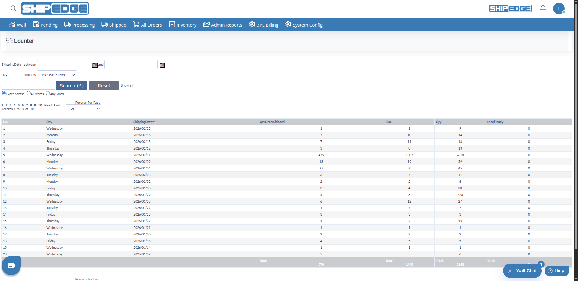
From the Dashboard, you can quickly access Counter:
Find the link
At the top of the Dashboard, you’ll see a link to Counter next to the title.
Click Counter
This will take you to the Counter page where you can manage counters.
Review the Dashboard at the start of each day to understand the current status of your operations and identify problems early.
Compare charts from different days to identify trends and patterns in your operations.
Red and orange colors indicate potential problems (backorders, oversold, damaged units). Investigate these cases.
Dashboard charts are useful for presentations and executive reports. Capture screenshots when necessary.
The Dashboard gives you an overview. For detailed analysis, use specific reports for each area.
Review the expenses chart regularly to identify days with unusual costs and optimize operations.
Make sure the green segment (Available) is the largest in the inventory chart to maintain healthy operations.
If you see a large orange segment (Oversold) in the inventory chart, investigate and correct the problem quickly.
Problem: Charts don’t appear or are blank.
Solution:
Problem: Charts show old data or don’t update.
Solution:
Problem: Values in the inventory chart don’t match detailed reports.
Solution:
Problem: I can’t find the option to filter by specific account.
Solution:
Problem: Chart colors don’t show or are incorrect.
Solution:
Problem: The third chart shows all values at zero.
Solution:
partial_invoice table for the last 14 days